
Honey Tourism
A honeymoon travel brand where the catalogue is the product and every screen leads to an enquiry.
Visit live site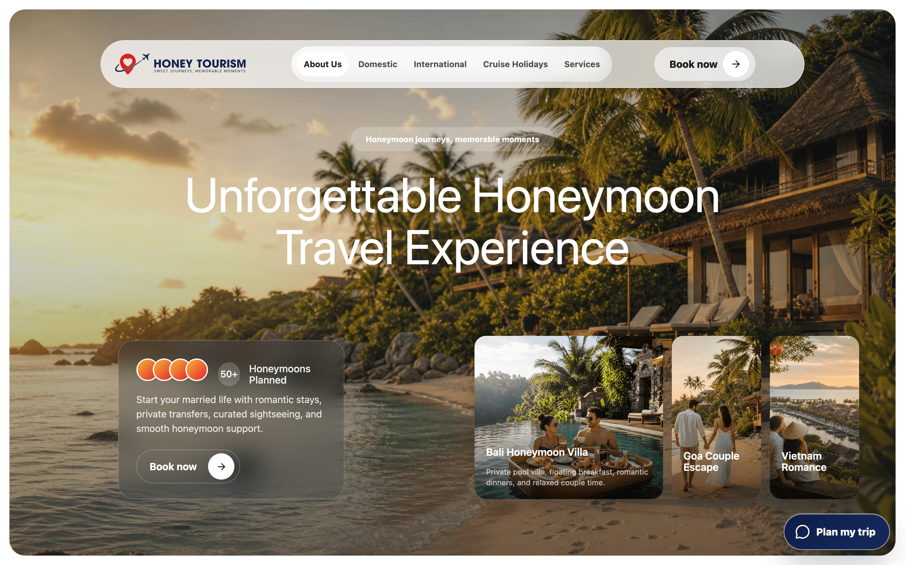
- Client
- Honey Tourism
- Industry
- Travel · Honeymoon packages
- Project type
- Business website & enquiry funnel
- Year
- 2026
- Services
- UX StrategyUI DesignFront-end DevelopmentResponsive DesignConversion TrackingDeployment
- Built with
- ReactViteLucideMeta PixelVercel
The business
Honey Tourism sells honeymoon packages across domestic and international routes, plus the visas, forex, insurance and flights that go with them.
For a travel agency the package list is the shopfront, but couples do not arrive searching for package names - some come with a destination, some with a budget, some only with a season. The site has to balance discovery, browsing, visual appeal, package context and enquiry conversion without overwhelming anyone.
The challenge
For a travel agency the package list is the shopfront, but couples do not arrive searching for package names. Some come with a destination in mind, some with a budget, some only with a season. One catalogue had to serve all three entry points across domestic and international routes, without burying the ancillary services the business also sells.
The approach
Navigation is destination-led and split into Domestic and International, with visas, forex, insurance, and flights given their own menu so they stay sellable without crowding the main path. Every package card carries its duration and what's included up front, so couples can compare without opening anything.
Destination-first discovery
Navigation led by destination and split into Domestic and International, so a couple starts from the place they have in mind.
Package hierarchy
Thirteen packages in a grid tagged by nights and destination, with duration and inclusions on the card so couples can compare without opening anything.
Visual storytelling
A photographic site - sunset villa hero, gallery section - because the destination sells the package.
CTA placement
A persistent 'Plan my trip' entry point and a Book now action on every package, so the next step is never more than a glance away.
Ancillary services
Visas, forex, insurance, e-SIM, passport help, flights and corporate tours given their own menu, sellable without crowding the main path.
Measurement
Meta Pixel conversion tracking wired in so campaign traffic can be measured against enquiries.
What we worked on
- Catalogue
- Thirteen honeymoon packages
- Duration and inclusions on every card
- Tagged by nights and destination
- Navigation
- Domestic, International, Cruise Holidays and Services
- Floating pill navigation
- Enquiry flow
- Persistent 'Plan my trip' entry point
- Per-package Book now actions
- Four-step booking explainer
- Visual design
- Photographic hero with glass card
- Gallery section
- Services
- Visa, insurance, forex, e-SIM, passport, flights, corporate tours
- Tracking
- Meta Pixel conversion tracking
The solution
A photographic site with a floating pill navigation, a glass hero card, and a thirteen-package grid tagged by nights and destination. A gallery section, a four-step booking explainer, and a persistent enquiry entry point keep the path to a booking open from anywhere on the page.
- Choose a destination
- Compare packages
- See what's included
- Plan my trip
- Enquiry
Business value delivered
A catalogue that works as a shopfront: three ways in, comparison without clicks, and a route to an enquiry from every screen.
- Easier package discovery from destination, budget or season
- Cleaner browsing - duration and inclusions visible before a click
- Clearer enquiry pathways from any point on the site
- A stronger, more photographic brand presentation
Let's build something worth visiting.
Tell us what you're building and what it needs to do. We'll come back with next steps, a scope, and a fixed quote.
Or email hello.luminixsolutions@gmail.com